Exhibition Mock Up

Exposure, Exposure- Planning

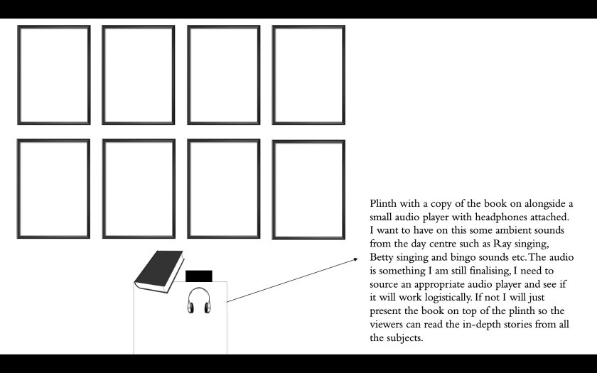
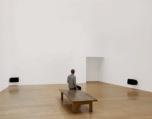
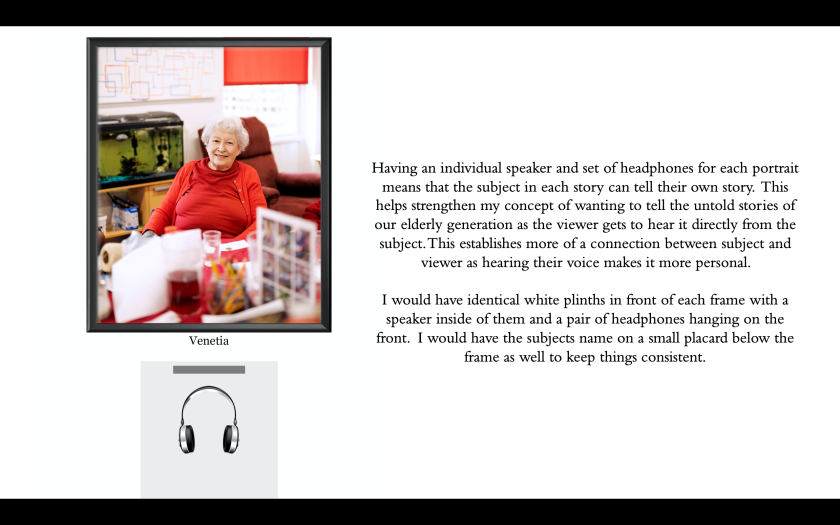
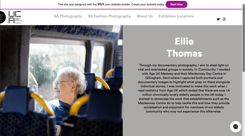
Due to the Coronavirus, our exhibition was unable to go ahead. As I had already planned my layouts and printed my images I decided to create a small mock up of my exhibit in my room using a small space of plain white wall and my bedside table as a plinth. I felt that it would be good to see my prints on the wall and would help convey the way I intended to present them. The alexa speaker on the plinth is supposed to be my audio player and the head phones are supposed to be the headphones which would’ve been connected to the audio player. My plan was initially with thin, black frames but as the exhibition was cancelled I didn’t have the chance to purchase them so I just stuck my images unmounted/framed on the wall for a general idea of how they would have looked.

Exhibition 4

Exhibition1 reduced

I used a spot light lamp which I had and I held it above my installation to try and mimic the spot lighting which surrounds the ceiling of the Halpern Gallery. Obviously it isn’t perfect as I was working with limited space and resources in my home but it was nice to see my prints in a similar fashion to how I wanted them to be displayed. The borders aren’t perfectly straight as I didn’t have a suitable guillotine to work with at home but the idea is still the same.

I laid out three copies of my book which accompanies the photo series as this is what I was going to do for the exhibition so people can read further into my concept and see more images and text from the series.

Exhibition 2

Overall, I am really pleased with the final layout I came up with for the exhibition, after seeing the images on the wall I am glad I chose to display them in a cyclical nature so it takes the viewer through a typical day at the Mackenney Centre. Family members in my household who came into my room to see it commented on this saying they liked the bookended start and end on the minibus which helps tell the story effectively. I am confident that if the exhibition went ahead I would have been very pleased with the final layout I chose.

Making the Exhibition Audio

Exposure, Exposure- Planning, Exposure- Research

I had planned to make the audio track in Uni so I could us premiere pro to fade in and out sounds etc. but due to lockdown I had to do it at home so only had basic IMovie software. However, I still managed to create a backing track which I was going to present alongside my work in the exhibition, I decided to only use singing audio as I was inspired by the work of Susan Philipsz who uses sound and singing to evoke feelings of loss, hope and nostalgia. I felt that the clips of Ray and Betty singing with the others at the day centre joining in and clapping along etc. best accompanied my images. These audio clips perpetuate the concept behind my images of combating social isolation as it shows the sense of happiness and community within the centre.

I displayed the images on top of the audio to mimic what you would see at the gallery. Overall, I am happy with the way the audio turned out, but if the project shooting time was longer I would have collated more ambient audio. Also, on my ideal exhibition plan (if time and money were no object) I wanted to include large scale portraits of my subjects with headphones connected to each one with them talking about their lives but due to space requirements I couldn’t fit this. I felt that it would confuse things including audio of individuals speaking as you wouldn’t know who it was talking so it was best to stick with singing/ambience then they can read the stories in the book.

REAL EXHIBITION DESIGN PLAN

Exposure, Exposure- Planning

After creating my ideal exhibition plan, I decided to take my favourite elements from this and curate a realistic plan. After talking with the curating team, I was informed that I have 49 inches of wall space to work with. I decided that I wanted to display the documentary images as create a smaller scale timeline of a day at the day centre like the large scale one in my plan. I decided I want to display 8 image so worked out that space wise I could fit 4 10×8 inch prints width ways and then put the other 4 underneath. This would allow enough space to have even room in between each print, in an ideal world I would have rather print larger scale to create that immersive experience like in my ideal plan but this would mean sacrificing the amount of images which would mean it was tricky to showcase an accurate timeline of the day.

Screenshot 2020-03-20 at 14.05.09

I decided I wanted to keep an element of audio, but as I am not displaying individual portraits, it wouldn’t work to have the clips of them all talking as you wouldn’t know who was who so I have decided to create a loop of audio clips of ambient sounds such as Ray and Betty singing and bingo audio which I have sourced a small audio player which headphones can be attached to which I will leave on the plinth. I felt it was a shame to have nothing on display which highlights the subjects individual stories so I will have a couple of copies of my book on display on the plinth also so the viewer can read more details of the more personal stories and impacts of the day centre. This also means they can read the intro which is in the book which highlights the impact of loneliness in the UK which heightens the importance of the day centre and the work of Age UK.

Images I have decided to print (NOT SQUARES):

Screenshot 2020-03-20 at 14.05.17

These are the 8 images I have decided to print, I tried to portray a day at the centre as accurately as possible. I started with an image from the mini bus, then an image through the front door to add to the immersive experience as it places the viewer in the perspective of a day centre client. Then I added some of my favourite documentary images which really sum up the community that has been built here for example, Ray singing and Betty dancing and then images of bingo and the hairdressers. Then I ended the series with an image on the minibus again to reflect the cyclical nature of the book and end the timeline.

I then edited my plan onto a photo of a wall in the Halpern Gallery which I took when we visited to see roughly how it would have looked.

Overall, I am really happy with this final exhibition plan- I feel that it has condensed my ideal plan nicely taking the best elements from it whilst working with the limited space provided. I have managed to include the documentary, story and audio elements but in a way which isn’t too busy. I feel that framing the images in a thin black frame will add to the uniformity and isn’t too busy which will take away from what is going on in the images. I stuck with all portrait images as I felt that I couldn’t balance both portrait and landscape orientations in the space provided and most of my most effective images were portrait so this was an easy decision. I will now print these images at university on Monday and source and purchase frames to present them in.

Research Into Audio-Visual Exhibition Presentation

Exposure, Exposure- Research

To create an ambience to go with my exhibit, I would like to include a small audio player and headphones which plays a continuous loop of sounds from the day centre. I want to include sounds I recorded such as laughter, singing, bingo sounds etc to help the viewer imagine the atmosphere which is within the day centre whilst they look through the timeline of images. I want to look into some artists who have used sound to accompany their works within a gallery setting to see the best way to approach this and the different ways it has been incorporated.

I found an article online which detailed an exhibition at The Arthur Ross Gallery based within Penn State University. This exhibition presented 10 photographs from the Penn Art Collection which were accompanied by a set of head phones each underneath. They commissioned a sound artist to make a bespoke track which goes with each image, this inter-disciplinary work means that the viewers auditory and visual senses are challenged.

Landscape/Soundscape

To play the sound (as seen above) they used an IPod which was concealed within a wooden box and then they connected two sets of head phones to this which hung from a hook attached to the box. I want to have a similar approach, but I will be using a more inexpensive, discreet audio player and will just place this on top of the plinth. I will attach the headphones to the plinth in a similar manner to this.

When I was looking into the presentation of sound within a gallery space, I came across the work of Susan Philipsz- a sound artist who is based in Berlin. She works with music and sound, often her own singing which she projects onto large empty spaces to examine the relationship between sound and the triggering of memories- she tends to explore the notions of loss, longing, hope and return.

Philipsz herself said-

“I am particularly interested in the emotive and psychological properties of sound and how it can be used as a device to alter individual consciousness.”

She has places her sound installations in several settings- some outside, some inside, examples of some of her previous installations can be seen below:

Picturesque scene of a lake and the green land which surrounds it with a speaker installed

Installation shot inside ornate building with record players inside

Installation view of Turner Prize winner Susan Philipszs Lowlands at Tate Britain October 2010 photograph of a white gallery with two audio speakers and a visitor sat on a bench

Although Philipsz works with purely sound it was beneficial to see her methodology on choice of sound and her connections with sound and memory as I want the sound to connect the viewer to the day centre and trigger more of an emotional connection hearing the subjects laughter and singing etc. I want my soundscape to transport the viewer and place them within the images.

I am going to experiment with my own sounds and create a suitable soundscape which I feel sums up the ambience of the day centre whilst looking into suitable audio recorders for me to use.


IDEAL EXHIBITION PLAN

Exposure, Exposure- Planning

This is an exhibition design/layout I created which showcases my ideal layout if money, time and space were no object:

Screenshot 2020-03-20 at 14.09.02

Screenshot 2020-03-20 at 14.09.11


Screenshot 2020-03-20 at 14.09.20

I would then have the remaining three walls dedicated to documentary images which show a timeline of a day at the Mackenney Centre:

Screenshot 2020-03-20 at 14.09.38

Screenshot 2020-03-20 at 14.09.29

Screenshot 2020-03-20 at 14.09.46

Screenshot 2020-03-20 at 14.09.57

Screenshot 2020-03-20 at 14.10.04

As, I won’t have anywhere near this amount of space and I don’t have the time or budget to plan something this large scale, I will now plan a more realistic idea which takes me favourite elements of this large scale plan but scaled down to nucleus size.

Printing and Deciding my Frames

Exposure, Exposure- Planning

Today we was in the digi-lab with John to print our final pieces ready to store at the gallery before opening night. After debating between vinyl and satin printing paper I went for satin printing paper as I felt that it best showcased my work as when John showed me an example of the vinyl it seemed a bit faded and didn’t showcase the colours as nice.

I decided to print 8 10×8 inch prints which were all portrait to create a 4×2 grid format on the wall (see planning post for more detail and image choice). In an idea world I would rather larger scale prints but within the space provided this is all I can fit if I want to showcase the story of a day at the day centre.

2A775DA5-4DCC-4284-8A8A-ED86AA878542 2

I decided to make a consistent white border around the images to add to the uniformity and I think that this gives the image nice space to breath from the black frames. I have chosen these frames from Wilkos as they are nice and simple with just a thin black border I am going to go and buy them soon.

Screenshot 2020-04-13 at 22.17.52

Screenshot 2020-04-13 at 22.17.55

* Update- due to the cancellation of the exhibition I didn’t purchase the frames as there was no need, but this was my plan before cancellation*

Creating my Artist Statement and Deciding Which Image to Showcase.

Exposure, Exposure- Planning

I have wrote my 100 word artist statement, I decided to focus the statement mainly on the series I am exhibiting rather than my personal history etc. As it is only 100 words I feel that this is best to convey the motives and story behind my work.

This is my statement:

Through my documentary photography, I aim to shed light on vital and overlooked groups in society. In ‘Community’ I worked with Age UK Medway and their Mackenney Day Centre in Gillingham, Kent where I captured both portraits and documentary images to highlight what goes on there alongside individual stories. I was motivated to make this work when I read statistics from Age UK which stated that there are now 1.4 million chronically lonely elderly people in the UK today. I wanted to showcase the work that establishments such as the Mackenney Centre do to help tackle this and how they provide socialisation and enjoyment for members of our elderly community who may not experience this otherwise. 

I felt that adding the statistic will help drive home my concept and motives to create the work and might encourage the reader to look into the tragic epidemic of social isolation which is effecting a large proportion of our elderly.

I chose this image to accompany my statement:

Heather bus

I felt that this image didn’t give away too much but still was a nice image which represented the joy the day centre provides our elderly. Its is also one of my favourite images from the series due to the composition and light which highlights the subjects face. I think it is a nice image to sum up the project due to her warm, happy expression as well.

This is how my image and statement looks on the Medway Photo Festival website:

Screenshot 2020-03-20 at 15.17.35

Visiting Rochester Art Gallery

Exposure, Exposure- Research

As the marketing and promotion group we decided to visit the Rochester Art Gallery which had an exhibition by local photographer Zara Carpenter which is titled Echoes. Although we have analysed the marketing and promotion side of the exhibition on our group blog ( www.emergencepromo.wordpress.com) I wanted to analyse the actual exhibition and the way in which Zara Carpenter laid out her work. It was really beneficial seeing a smaller scale, local exhibition like this one to get a sense of what Emergence could be like due to the rooms being similar size it is more realistic than our original plan of going to a large gallery in London like the Tate.

Echoes showcases Carpenters self portraiture work which shows her battle with her the condition Fibromyalgia. The images are all highly experimental often being taken on polaroid cameras and with techniques such as wet plate collodion- she describes herself as ‘digging through the many layers of pain like an archaeologist digging through the earth to uncover relics’.

This experimentation and battle with her own pain is reflected in the layout of her work- it isn’t uniform and the walls are filled with various sized prints which are all printed onto several mediums and some are ripped etc which creates a sense of chaos. In her artist statement she states that he work symbolises an act of catharsis and ultimately of healing and hope. Alongside her experimental prints on the walls she also featured a video installation piece and even a cabinet with relics and photographs being displayed in it this also helped give me a sense of how a multi format exhibition can look. This is useful as our exhibition is collaborative so therefore everyone is working across different mediums.

IMG_5991

The variation of image sizes compliments Carpenters aesthetic as her images are complex and multidimensional so the unconventional layout encourages the viewer to look closer and appreciate the art on display. Not all of the images are placed at eye level either which makes it harder to view the art so the viewer has to work harder to view all of the pieces. As this is a solo show that works fine as all the images compliment each other and the scattered layout is continuous throughout the room but as I will only have a small space I think sticking to eye level will mean that people take the time to view my work and it wont look out of place compared to everyone else’s pieces.

The Rochester Art Gallery had similar lighting to the Halpern Gallery as it had spot lighting on tracks going round the ceiling which creates nice bright lighting to illuminate and showcase the work. However, Carpenters work is stuck directly to the wall which is something we are unable to do so this scattered look will probably be unachievable for us. But I do not think that this would suit my work personally anyway as it is documentary and factual so I think that I will use a clean, neat approach to presenting my work so it doesn’t distract from the story of the day centre I am trying to tell. Even though my work encompasses an entirely different aesthetic, visiting this exhibition was extremely valuable to see what a smaller scale, local exhibition looks like.


Layout Ideas From the MOMA

Exposure, Exposure- Research

Whilst in New York, we visited to the MOMA gallery. As I knew we were creating an exhibition I paid close attention to the presentation of the works on display and took some photographs of them so I could reference back to them when creating my ideal and realistic layout designs for our exhibition.

IMG_8920

It was great to see the works from photographers who have a source of inspiration to my work for many years in person for example Bernd and Hilla Becher and Edward Weston. IMG_6465

I was particularly looking for the ways artists and photographers framed and laid out their work when taking photographs for inspiration. I was particularly drawn to these three large scale paintings:

IMG_0238

I really like the aesthetic quality that large scale prints bring it adds an immersive quality to the installation and I think that this is something that would work well with a documentary series like my own. I also really like the simplistic black framing which is another aesthetic quality that I think would compliment my series well as it doesn’t detract from the images but still adds a nice sense of uniformity. I am going to do an ideal exhibition plan where I can experiment with large scale images but for my idea plan I will have to stick to smaller images as I want to present a series to show a day at the day centre so will not have the room to present bigger than A4.

The clean, uniform aesthetic of the sleek black frames is still consistent even when paired with a much smaller print size like this series by Edward Weston. This would be a more achievable layout for me with the space I have to work with so thats why I paid close attention to the layout. The only thing is, at the Halpern Gallery you cannot hang directly to the wall so it will not be flat to the wall like Weston’s layout as you have to clip it to the invisible thread from the runners.

IMG_0222

I was also drawn to the aesthetic of this print by Jan Dibbetts which was on display, unlike most of the other photographic work I saw it wasn’t framed it was mounted and raised off of the wall so had no border. I think that this method of presentation is really effective when in context with her image as it is an empty room the lack of frame draws you in and almost makes you forget it is a photograph. Also as it is a one off print and not in a series I think it works really well as a stand alone image. If I could mount directly onto the wall in Nucleus this might be something I experiment with but I think for a series of images like I will be presenting a frame would work better. Also, I thought of trying to use vinyl as you are allowed to put vinyl straight onto the wall but when I spoke to John and he showed me examples I didn’t like the dull quality which it gave the image and I much prefer the rich vivid colours of the prints on silk paper.

I will keep in mind all these presentation ideas when planning both my ideal and real exhibition plans, it was really helpful seeing the installations in person to get a sense of how size and scale affects the viewer experience. With the marketing team we are going to visit a smaller exhibition at some point soon so I will take note of how the photographer exhibiting laid out their work as it will be good to see a smaller scale exhibition as the MOMA is a much larger scale than the Halpern gallery so its hard to compare.


Visiting the Halpern Gallery

Exposure, Exposure- Planning

Today, we visited the Halpern Gallery at Nucleus Arts as a group so we could see the space before planning the exhibition. Although I am on the Marketing team, not the exhibition instal or design team it was still incredibly useful to visit the gallery so I could see what the space was like before I planned what I wanted to exhibit.

I took these photographs to help me whilst visualising and planning my layouts so I could remember the aesthetic of the room. I really like the flooring and the plain white walls and bright lights I think the simplicity means that it will compliment all of our styles and as this is a group exhibition it is important.

I am thinking that I want to present a clean, uniform layout using thin black frames as this will compliment the minimalistic interior of the gallery space. Also, you cannot hang or stick directly onto the wall so frames will mean it will easily be able to attach to their hanging system of the wire and runners. Also, in the woodwork workshop they told us about attaching a small block of wood at the bottom of the frames to prevent it from tilting towards the wall so this is something I will look into.

I am going to plan my layout (both in an ideal world and realistic) now to visualise what it is I want to present.